📱 How to Optimize Your Website for Mobile-First Indexing
Featuring JumboNIC
Google now uses mobile-first indexing, meaning it primarily looks at your website’s mobile version to determine rankings. If your site isn’t mobile-friendly, you risk losing traffic, visibility, and conversions.
This guide will show you how to optimize your website for mobile-first indexing, step by step, while leveraging JumboNIC hosting for speed and reliability.
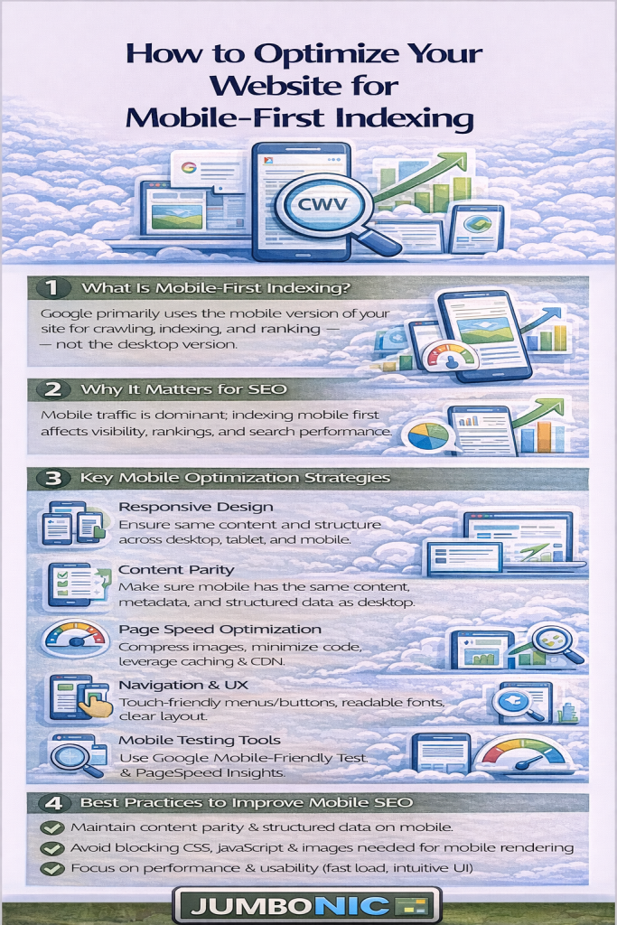
🧠 Why Mobile-First Indexing Matters
Mobile-first indexing means:
Google evaluates your mobile site first, not desktop
Pages that perform well on mobile rank higher
Poor mobile experience → lower rankings and higher bounce rates
Over 60% of global web traffic comes from mobile devices — your website must cater to them.
🟦 Step 1: Check Mobile Usability
Tools to Use:
Google Search Console → Mobile Usability
Google’s Mobile-Friendly Test: https://search.google.com/test/mobile-friendly
🟩 Step 2: Optimize Page Speed for Mobile
Mobile users expect fast-loading pages. Slow pages increase bounce rates.
Use Google PageSpeed Insights to identify bottlenecks
Compress images using plugins like Smush or ShortPixel
Minify CSS and JavaScript using caching plugins like WP Fastest Cache
Use a Content Delivery Network (CDN) to serve content faster globally
JumboNIC’s optimized servers help your site load quickly for both mobile and desktop users.
🟦 Step 3: Implement Responsive Design
Make sure your website adapts to all screen sizes (smartphones, tablets, desktops)
Use responsive WordPress themes or frameworks
Avoid fixed-width layouts that require horizontal scrolling
Responsive design ensures that your mobile experience matches or exceeds desktop, which Google prioritizes.
🟩 Step 4: Optimize Images and Media for Mobile
Large images can slow down mobile pages. Optimize them by:
Using WebP or compressed formats
Scaling images to fit mobile screens
Lazy-loading images so they only load when visible
With JumboNIC hosting, image delivery is fast, reducing load time for mobile users.
🟦 Step 5: Simplify Navigation for Mobile Users
Use clear menus and buttons
Make call-to-action buttons large and easy to tap
Avoid pop-ups that cover the screen
A simplified mobile navigation reduces frustration, keeps visitors engaged, and improves SEO metrics.
🟩 Step 6: Test Mobile SEO Elements
Title tags and meta descriptions should fit mobile screens
Ensure structured data is present on mobile pages
Check that internal linking works on mobile devices
Tip: Google uses the mobile page for indexing, so any missing elements on mobile can hurt rankings.
🏆 Step 7: Leverage JumboNIC Hosting for Mobile SEO
| JumboNIC Feature | Mobile SEO Benefit |
|---|---|
| High-speed servers | Pages load fast on mobile → better Core Web Vitals |
| Optimized WordPress hosting | Plugins and mobile themes work flawlessly |
| Reliable uptime | Pages always accessible for mobile crawlers |
| Free SSL included | Secure browsing builds trust and SEO authority |
With JumboNIC, your mobile site is fast, secure, and always available, ensuring Google indexes your content correctly.
🎯 Quick Mobile-First Optimization Checklist
✅ Test mobile usability with Google tools
✅ Optimize mobile page speed
✅ Use a responsive design
✅ Compress and scale images for mobile
✅ Simplify navigation and buttons
✅ Check mobile SEO elements (titles, meta, structured data)
✅ Host on a fast, reliable server like JumboNIC
🎉 Final Takeaway
Optimizing for mobile-first indexing is no longer optional — it’s a ranking and user experience necessity.
By following these steps and hosting your site with JumboNIC, you ensure your website is:
Fast and responsive on all devices
Easy to navigate for mobile users
Optimized for Google’s mobile-first indexing
Mobile-first optimization + reliable hosting = better rankings, more traffic, and happier visitors.